Welcome to my first forays into "datart". I call these works data ditties. Folks who work with data and those with art share a common trait: curiosity. This curiosity leads us beyond the surface of things, often with social impact. So far I'm experimenting with pretty basic topics as I learn about how to activate data in compelling ways. From these simple experiments, I've already learned that what we choose to focus attention on is as important as how we do it. There's a lot to learn, so it's a good thing I love learning.
PS:
This project is wholly motivated by personal interest and curiosity. A total passion project. It pulls together so many things I love doing:
- making images
- telling stories
- crunching numbers
- connecting dots
- being silly
- being serious
And, it taps into something Rob Walker says, pay attention to what you pay attention to, which has really got my curiosity going even more.
So, we'll see where this goes.
my first data ditty ...
and thoughts on a 1st try playing with numbers
some stuff in my living room
January 2022
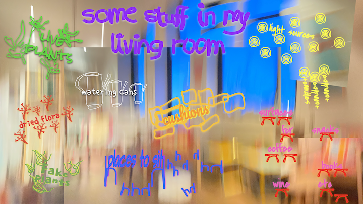
For my first foray into data ditty-making, I decided to go with a super simple subject and so chose to count some stuff in my living room: cushions, seating, side tables, light sources, plant life (fake and otherwise). Next, I wanted the piece to be really easy to read and so went with a design that embeds the counting and key within the image rather than producing an external legend. I do a lot of photo-based work and so made a pretty abstract image of my living room to honor my privacy. Using an unusual image was creatively interesting to me, which I hoped would be for viewers too.
These decisions combined — counting simple living room elements, a compelling image, and an embedded tally — made for a very approachable concept to execute both creatively and technically. And yet. Even at such a basic entry point to play with data, I quickly discovered the amount of forethought one needs to bring to counting, most notably reminding me, again, how editorial counting is. Yes. Counting counts. Numbers are not neutral.
That's not a revolutionary statement, counting counts, numbers are not neutral, plenty of political scientists, economists, accountants, administrators and activists tell us this, and show us how. But here’s what is revolutionary: producing your own numbers — making the decision about what gets counted (and, by extension, what doesn’t). Even with this silly little data ditty, the subject can still demonstrate the power and impact of what gets counted: why cushions and not pictures on the wall; why not include windows in the lights sources count? Light sources might seem like innocuous data points, but not so much when counting things where the stakes are high, like, for example, the number and size of windows in a classroom, or a hospital, or an affordable housing complex. All places where those inside have no power over how much natural light they experience, and where, in each case, light is a significant factor in the location’s purpose. After all, these are settings where we’re meant to learn, heal, and live.
Equally powerful: deciding how to represent the numbers, entailing careful consideration about how the data will appear on the front end for the viewer so the information is readily understood by someone newly encountering the subject and its story — ie: UX, user experience; design-thinking. Empathy.
Let’s be clear, I’m not a trained designer and so my data viz skills will be as good as they can be for a “civilian” with an awareness of design-thinking. some stuff in my living room, I’m sure, in the hands of pro designer would be way different, and better. That said, I’m still going to try. And so should you. Everyone should!
When finished making some stuff in my living room and reflecting on the piece, I began to notice the stories, or rather, the hints at stories. In museum education this is called close-looking. This is where we use critical thinking to enter the frame, looking for cues and clues. In this case, my close-looking surfaced the question: Why do I have 3 watering cans and only 2 live plants? (Small plants at that.)
When put in relationship with each other, those two sets of numbers stuck me as odd. Two sets of seemingly inconsequential data points, when thought about in tandem, point to a curious incongruency. Why so many waters cans and so few plants to water? When I asked myself that question, I soon knew the answer.
Even a simple data ditty like some stuff in my living room speaks to the politics of data; it speaks to the power of data to teach critical thinking; and it definitely spoke to me personally about how critical thinking leads to insight and self-knowledge. The watering can/plant ratio question and its answer were not, at the outset, things on my mind in any explicit way, yet they emerged and spoke to me in very plain terms, revealing meaning to me about my life in this new city.
So, even though this first data ditty exercise seemed pretty silly at first blush, it still confirms my belief that making personal data ditties and then reading them is worthwhile. It also furthers my belief that it's a great way, and a very fun and approachable one, to develop an unusual thinking and interpreting muscle. I might not always lead to surprising results and self-knowledge, but it might if you try.
January 2022
For my first foray into data ditty-making, I decided to go with a super simple subject and so chose to count some stuff in my living room: cushions, seating, side tables, light sources, plant life (fake and otherwise). Next, I wanted the piece to be really easy to read and so went with a design that embeds the counting and key within the image rather than producing an external legend. I do a lot of photo-based work and so made a pretty abstract image of my living room to honor my privacy. Using an unusual image was creatively interesting to me, which I hoped would be for viewers too.
These decisions combined — counting simple living room elements, a compelling image, and an embedded tally — made for a very approachable concept to execute both creatively and technically. And yet. Even at such a basic entry point to play with data, I quickly discovered the amount of forethought one needs to bring to counting, most notably reminding me, again, how editorial counting is. Yes. Counting counts. Numbers are not neutral.
That's not a revolutionary statement, counting counts, numbers are not neutral, plenty of political scientists, economists, accountants, administrators and activists tell us this, and show us how. But here’s what is revolutionary: producing your own numbers — making the decision about what gets counted (and, by extension, what doesn’t). Even with this silly little data ditty, the subject can still demonstrate the power and impact of what gets counted: why cushions and not pictures on the wall; why not include windows in the lights sources count? Light sources might seem like innocuous data points, but not so much when counting things where the stakes are high, like, for example, the number and size of windows in a classroom, or a hospital, or an affordable housing complex. All places where those inside have no power over how much natural light they experience, and where, in each case, light is a significant factor in the location’s purpose. After all, these are settings where we’re meant to learn, heal, and live.
Equally powerful: deciding how to represent the numbers, entailing careful consideration about how the data will appear on the front end for the viewer so the information is readily understood by someone newly encountering the subject and its story — ie: UX, user experience; design-thinking. Empathy.
Let’s be clear, I’m not a trained designer and so my data viz skills will be as good as they can be for a “civilian” with an awareness of design-thinking. some stuff in my living room, I’m sure, in the hands of pro designer would be way different, and better. That said, I’m still going to try. And so should you. Everyone should!
When finished making some stuff in my living room and reflecting on the piece, I began to notice the stories, or rather, the hints at stories. In museum education this is called close-looking. This is where we use critical thinking to enter the frame, looking for cues and clues. In this case, my close-looking surfaced the question: Why do I have 3 watering cans and only 2 live plants? (Small plants at that.)
When put in relationship with each other, those two sets of numbers stuck me as odd. Two sets of seemingly inconsequential data points, when thought about in tandem, point to a curious incongruency. Why so many waters cans and so few plants to water? When I asked myself that question, I soon knew the answer.
Even a simple data ditty like some stuff in my living room speaks to the politics of data; it speaks to the power of data to teach critical thinking; and it definitely spoke to me personally about how critical thinking leads to insight and self-knowledge. The watering can/plant ratio question and its answer were not, at the outset, things on my mind in any explicit way, yet they emerged and spoke to me in very plain terms, revealing meaning to me about my life in this new city.
So, even though this first data ditty exercise seemed pretty silly at first blush, it still confirms my belief that making personal data ditties and then reading them is worthwhile. It also furthers my belief that it's a great way, and a very fun and approachable one, to develop an unusual thinking and interpreting muscle. I might not always lead to surprising results and self-knowledge, but it might if you try.
data ditty 2 ...
a bit more consequential in content
and more revealing about the potential for interpretation and impact
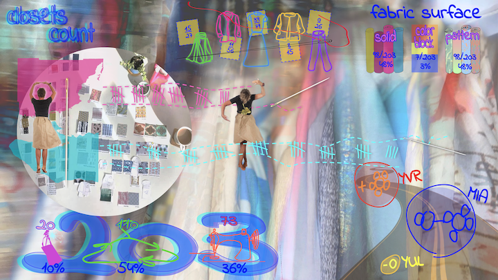
closets count
February 2022
Since it's still frightful weather outside, I continue to look to what I can count indoors, at home. So I turned to my closets.
There's an important caveat to fess up to at the outset: I'm a clothing designer and pattern-maker (now as a hobby, albeit a serious one) and clothing is a serious subject to me. Relatedly (maybe), I have a lot of clothes. Nonetheless, the closet count yielded some pretty interesting results, and again I found myself surprised by some of the information revealed. For example: I thought I wore a lot more solids than patterns. (I was also a bit shocked by how much is in my closets.)
As for close-looking and the deeper stories a bit of critical thinking can surface, I noticed this: How come so little clothing activity--purchases and production--in YUL compared to YVR and MIA? (Another personal question that surfaced for me, and surprised me, in the same way that the watering can/plant life numbers surfaced an insight when I was contemplating the some stuff in my living room data ditty.) As for broader interpretations - those relating to a world further afar and with important implications and ramifications - the ratio of used clothing to new in my purchasing habits speaks to the ecosystem of clothes: consumption; supply chains, labor conditions; textile waste; closed loops; upcycling; etc., as well as speaking to the social status and pressures culture and capitalism can impose.
I collected a lot more data than what's represented here. Some of it is pretty insignificant, like sleeve and hem length--although that too offers promise in a guided conversation like those I do with students on gallery tours. For example: if the data ditty tells us that my closet is full of short-sleeved and sleeveless items, I probably don't live in a northern climate. This speaks quietly to bits of meta-data about the maker, on an interpretive level speaking more to art history and an artist's biography. So though not really speaking to any kind of broader global impact, the sleeves reading is valuable anyway in exercising close looking, from which more parts of a story can be brought into the light and discussed.
Here's an example of this same close-reading re: clothing (and a bit more) in a painting called Subway, made in 1935 of a busy NYC subway car. As the Wolfsonian's education manager and teaching artist, it's really fun to activate this piece with high school students in Miami. And it goes like this: I first remind the kids that the painting was made in 1935. Then I ask them to imagine that Miami had a subway in 1935 (it didn't). Next I ask: Is this what you would see in a subway car in Miami in 1935? Eventually they surface two significant reasons why this would not be a subway scene in Miami in 1935, and their responses usually come in this order: 1/ People are wearing felt hats and heavy coats, which nobody wears in Miami (these are tells just like those about shortsleeved and sleeveless garments--although the climatic significance works in the inverse); and, 2/ Miami was still segregated and so black folk and white folk would not be traveling together in the same subway car. Clearly these two observations carry very different weight, yet both speak to the power of close looking and what details tell us, some significant socially and some significant in other ways, even apparent minutiae like clothing.
As for some other closets count numbers I collected but didn't include, some return us to the ecosystem of clothes and more consequential data re: global impact, like fiber content (in my case, cotton, 72%; linen 5%; silk 9%; silk-cotton batiste, 6%; wool; 5%; other, 1%), which is the kind of counting that counts in all kinds of ways.
What's still missing is the legend—the key to reading some of the data points through the symbols I chose. Because I'm embedding everything within a photograph I wish I didn't have to place some of the story elements outside the frame. If I come up with more explicit representations that tell us what certain data means, there would be no need for an external key.
So, in this closets count piece, what isn't totally and explicitly clear is the way I counted the amount of time these items have been in my closets. I used a bit of a flower motif to do that. In the lower right corner, laid over a diminishing road are three sets of small circles, and each small circle represents one year. It reads like this: the yellow part, -O/YUL, means less than 1 year, which is my time in Montreal; the blue part means 2-5 years, the length of time I lived in Miami; and the red part means more than 6 years, which is how long ago I lived in Vancouver (but doesn't further specify exactly how much older than 6 years those items are).
While closets count is still not where I want my data ditties to be as visual communication and story-telling, I'm making progress. Learning by doing.
retroactive data ditty
(impromptu insert)
March 2022
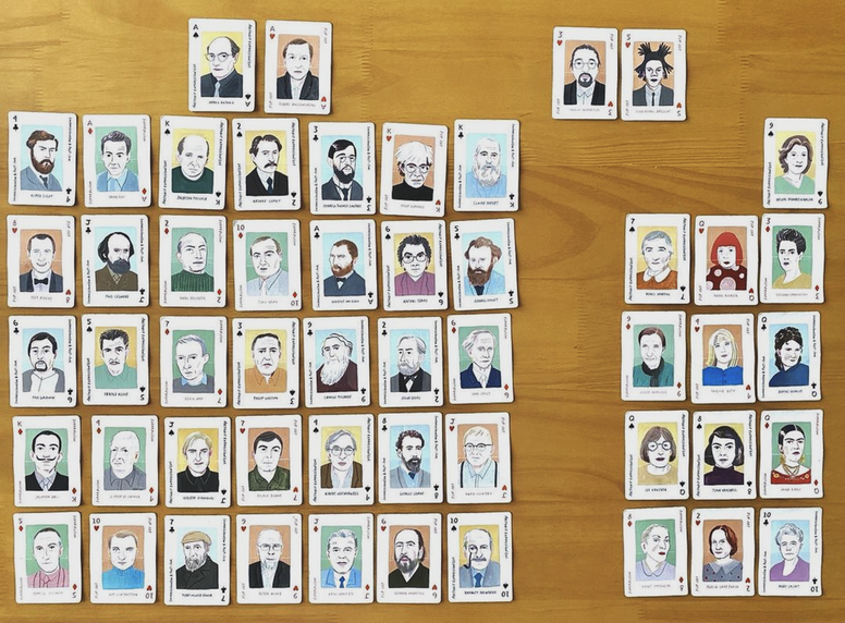
I like to play solitaire while listening to podcasts or catching up on the late night monologues. And I like to play with a deck of cards, old school, analogue. A year ago while playing, I noticed something about the card deck I was using and took this picture.
Today, with my thinking in data viz mode, I remembered the picture, realizing it too is a data ditty.
The card deck is called "Art Genius" and its marketing copy says that the deck "includes 52 playing cards featuring illustrations of all the big names in the art world". All the big names? Really? All of them? Well, let's see.
By simply laying the cards on the table and categorizing the artists by race and sex, and without using any graphic flourish or any graphs at all, the story tells itself. Sadly, I was shocked but not surprised.
(impromptu insert)
March 2022
I like to play solitaire while listening to podcasts or catching up on the late night monologues. And I like to play with a deck of cards, old school, analogue. A year ago while playing, I noticed something about the card deck I was using and took this picture.
Today, with my thinking in data viz mode, I remembered the picture, realizing it too is a data ditty.
The card deck is called "Art Genius" and its marketing copy says that the deck "includes 52 playing cards featuring illustrations of all the big names in the art world". All the big names? Really? All of them? Well, let's see.
By simply laying the cards on the table and categorizing the artists by race and sex, and without using any graphic flourish or any graphs at all, the story tells itself. Sadly, I was shocked but not surprised.
data ditty 3 ...
things are picking up momentum
and now reveal more about the importance of what we chose to count
(plus what it reveals, and so might impact)
my IG story
March 2022
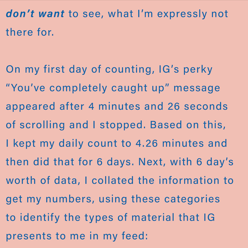
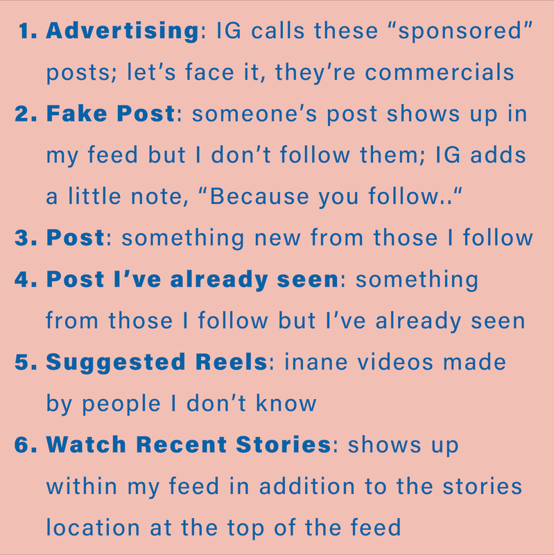
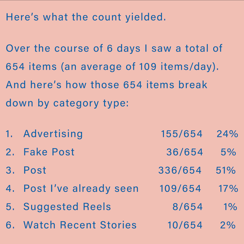
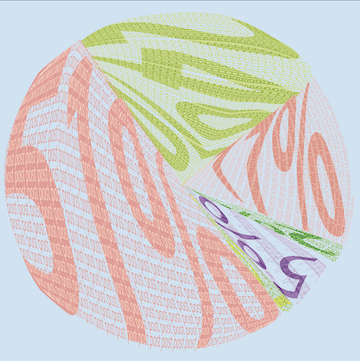
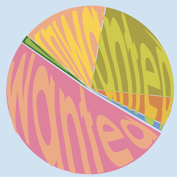
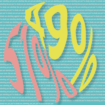
Next, something a bit more consequential. Call it meta-humor, NO pun intended. I'm happy with what I learned. First, still more learning about counting - this time centered on learning more about how to capture what I want to count from a tech point of view. And then pretty amazing learning in terms of what the counting revealed about IG, its algorithms, and how much of my time they harvest. I wish I could say I was surprised to see what my IG story told me. But I'm not. I've long loathed the term "consume content" and even though I won't use that language myself, I guess there's no way of escaping its application in my life, like it or not. As for the visual activation of the information, it's pretty underwhelming to me. It's just ok.
Because I designed my IG story for direct posting to IG--as a post, not as what they call a "story"--all the data and interpretive background required to understand this ditty's story is contained within the set of 9 layouts. I toyed with the idea of describing my whole process - what tech I used to acquire all the data - but then decided it wasn't all that important to the front-end experience. That said, my motivation to include all that info was to demonstrate the overall integrity of the methodology--did my data collection process have integrity? Is the data reliable and valid? (Basically, to explicitly introduce more STEAM stuff.)
After collecting and crunching the numbers, I spent a lot of time on how to represent my findings. As I said, it looks ok. But barely. Now, more than ever, I'm so super appreciating the art of graphic design and all the skills and knowledge, experience and talent that go into making the discipline sing.
SO much for me to learn.
March 2022
Next, something a bit more consequential. Call it meta-humor, NO pun intended. I'm happy with what I learned. First, still more learning about counting - this time centered on learning more about how to capture what I want to count from a tech point of view. And then pretty amazing learning in terms of what the counting revealed about IG, its algorithms, and how much of my time they harvest. I wish I could say I was surprised to see what my IG story told me. But I'm not. I've long loathed the term "consume content" and even though I won't use that language myself, I guess there's no way of escaping its application in my life, like it or not. As for the visual activation of the information, it's pretty underwhelming to me. It's just ok.
Because I designed my IG story for direct posting to IG--as a post, not as what they call a "story"--all the data and interpretive background required to understand this ditty's story is contained within the set of 9 layouts. I toyed with the idea of describing my whole process - what tech I used to acquire all the data - but then decided it wasn't all that important to the front-end experience. That said, my motivation to include all that info was to demonstrate the overall integrity of the methodology--did my data collection process have integrity? Is the data reliable and valid? (Basically, to explicitly introduce more STEAM stuff.)
After collecting and crunching the numbers, I spent a lot of time on how to represent my findings. As I said, it looks ok. But barely. Now, more than ever, I'm so super appreciating the art of graphic design and all the skills and knowledge, experience and talent that go into making the discipline sing.
SO much for me to learn.


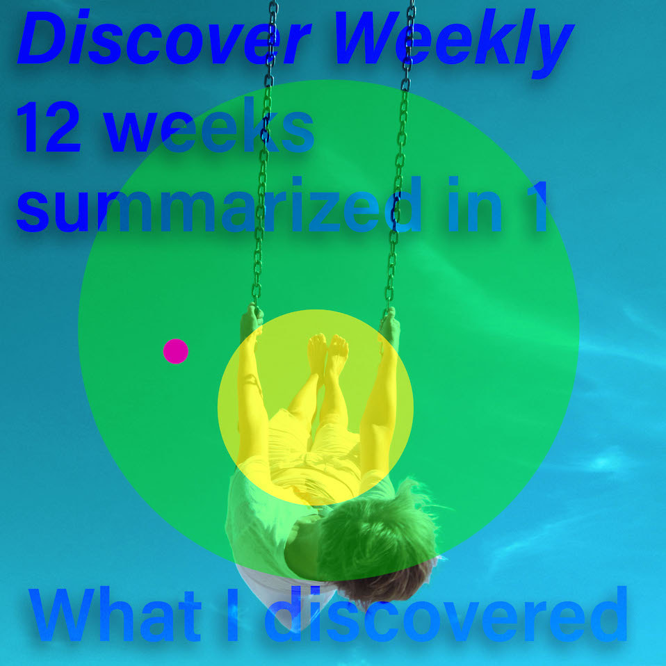
data ditty 4 ...
inspired by #3 and the focus on social media, I present
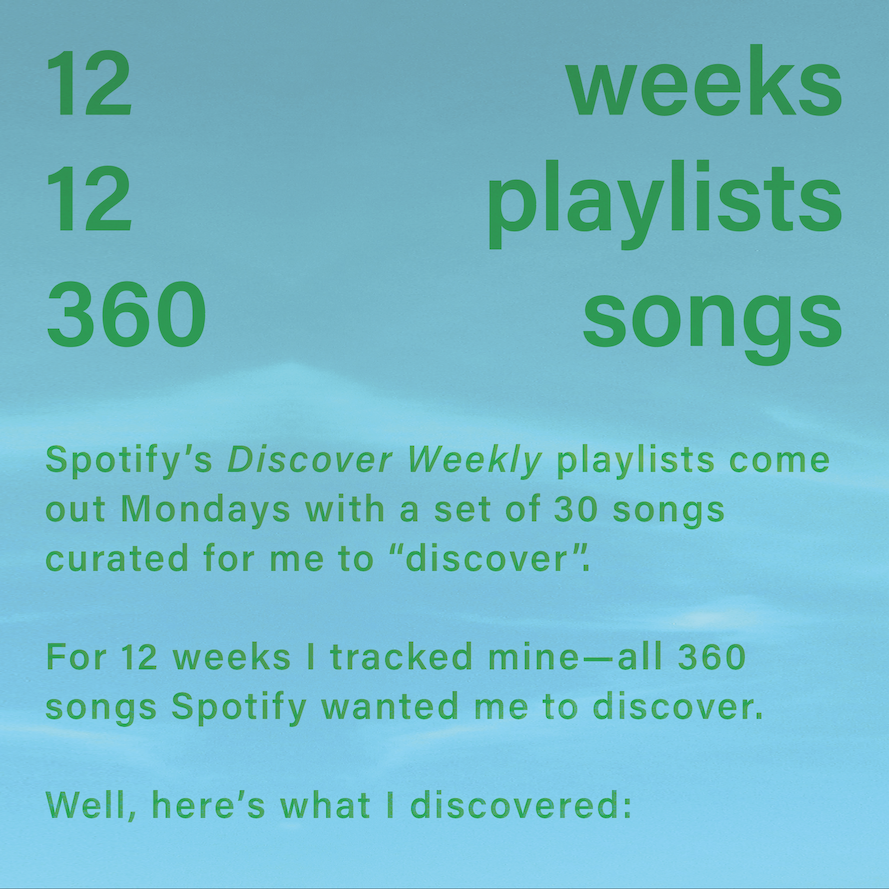
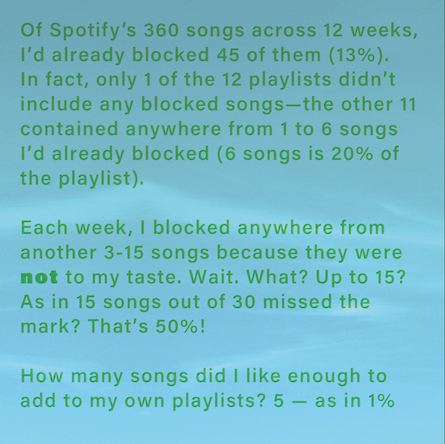
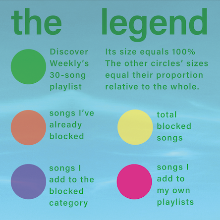
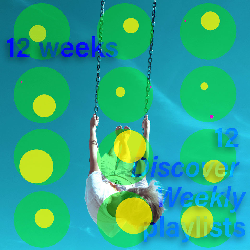
What I Discovered from Spotify's Discovery Weekly playlist
The full piece includes a short video that I'm unable to upload here so please have a look at my IG post to view it (oh, the irony).
The full piece includes a short video that I'm unable to upload here so please have a look at my IG post to view it (oh, the irony).